2022 Marketing Trends
A Year in Review
We’ve come to one conclusion while reflecting on the 12 months. 2022 was a strange year—but not like the past few. Things weren’t necessarily chaotic or unprecedented. Life wasn’t stagnant or predictable either, but we haven’t exactly found a normal rhythm yet. Instead, everything was sort of stuck somewhere in the middle. And that’s how the 2022 marketing trends played out too.
Everything fluctuated between two extremes—innovation and regression. Collectively, everyone made progress in some areas but took noticeable steps back in others. We were introduced to significant changes in the marketing world but also returned to some familiar concepts. But 2022 also proved that being stuck in the middle isn’t necessarily bad. It just means we’re ready to move forward and find balance.
BRANDING
Frasurbane Revival
The last few years have been an endless rotation of nostalgic design trends. And in 2022, the go-to throwback look became even more niche. Enter the revival of Frasurbane. It’s a micro-movement inspired by the rise of old-world vintage home décor from the late 80s and early 90s, hence the distinct beige look. And yes, the style is named after the sitcom Frasier.
The term was coined in 2017 by the Consumer Aesthetics Research Institute (CARI). “[So] many aspects of the TV show Frasier [exemplify] qualities of this style; from the interior design of his apartment to the constant obsession with appearing cultured and sophisticated.” It’s academic, refined, and luxe—but approachable enough for suburbanites.
“The style seems to have emerged in the late 1980s, as Baby Boomers were hitting their peak-yuppie years, settling down, and looking to adopt a more sophisticated aesthetic and lifestyle,” CARI’s lead curator Evan Collins told VICE.
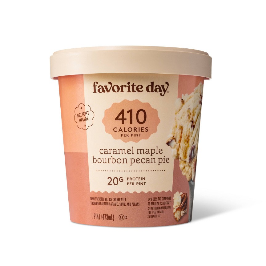
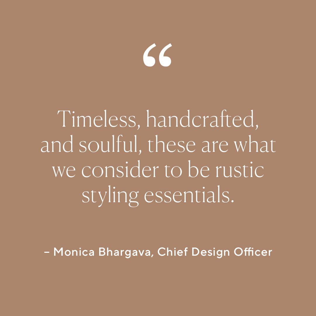
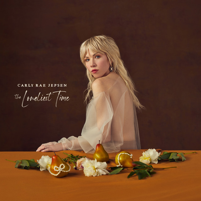
Now, Frasurbane has crossed over into design, styling, and branding trends. And you may not have known its name, but you’ve likely seen the look. It’s appeared on everything from social media posts to product packaging. Think coffee stains, red wine, natural textures, sepia photos, and earthy tones. Serif fonts and neutrals are a must. Timeless imagery is essential. 90s Surrealism and Art Deco elements are optional.
“Baby-level Frasurbane is a 1990s Scholastic book fair, or peak Discovery Store. Full blown, adult Frasurbane is about Vitruvian Man decor, globes, and drowning your existential crises in espresso—it’s 90s Ethan Allen, Pottery Barn, and companies like Bernhardt Design, or Donghia.”
WEB DEVELOPMENT
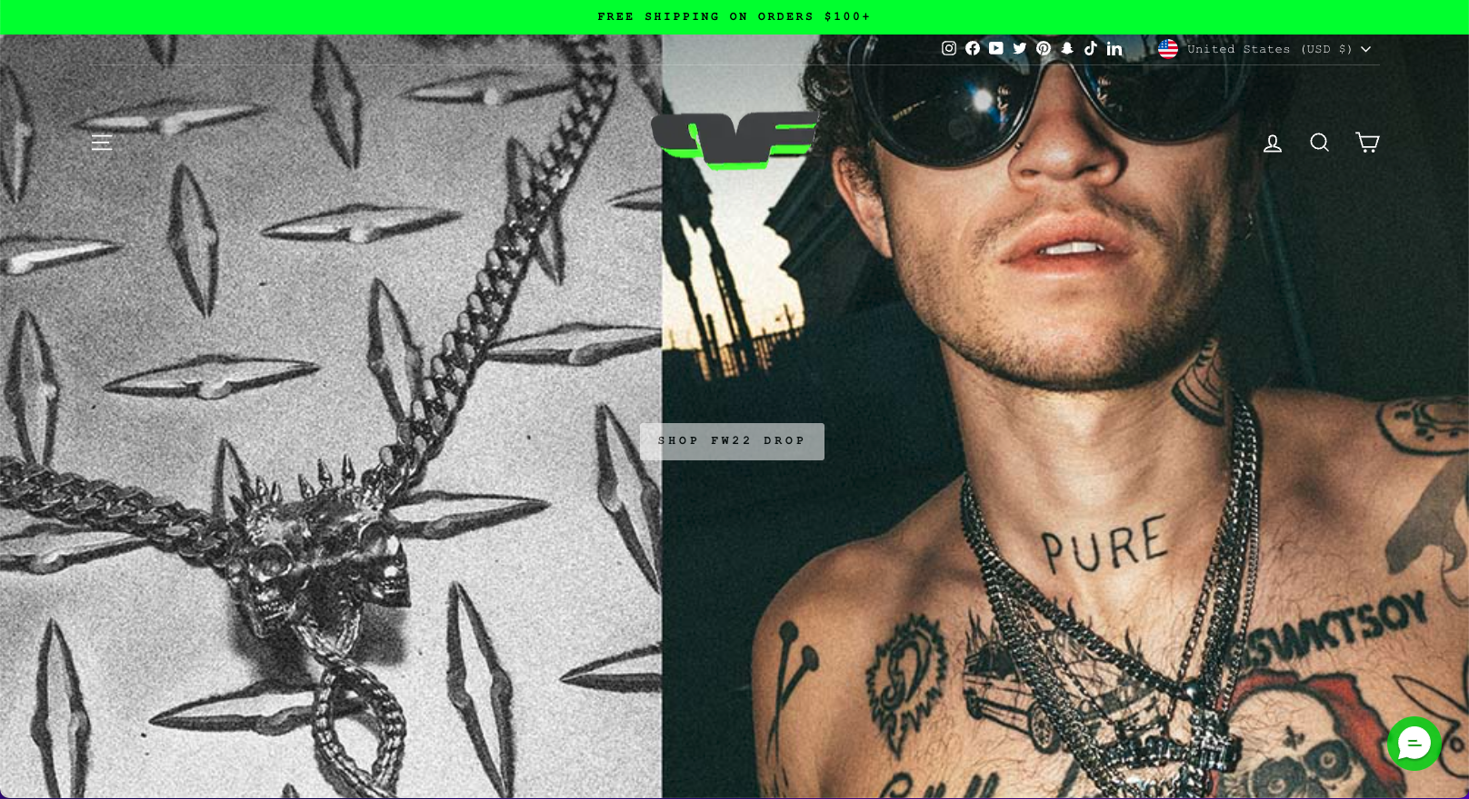
Neo-Brutalism in E-Commerce
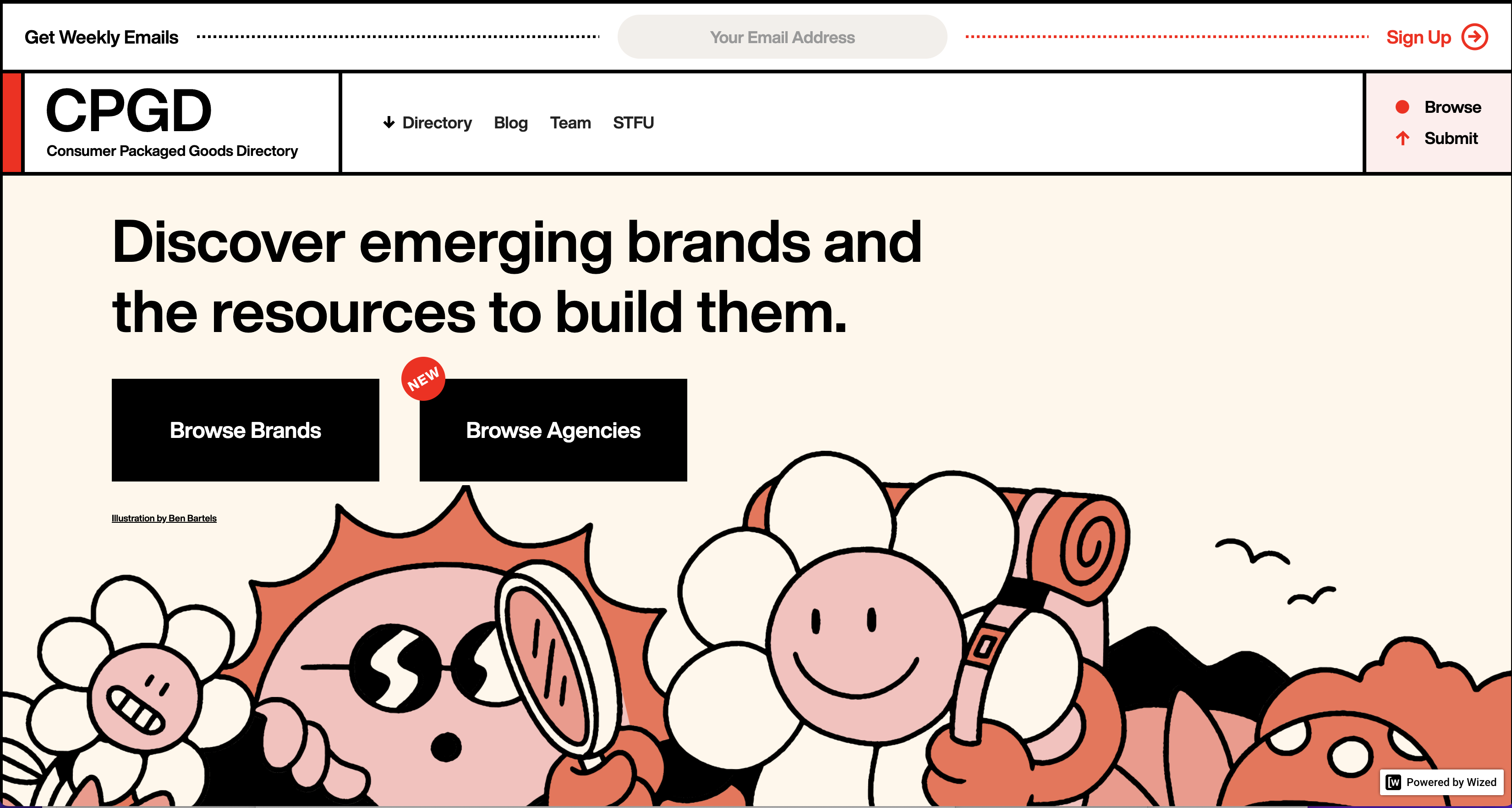
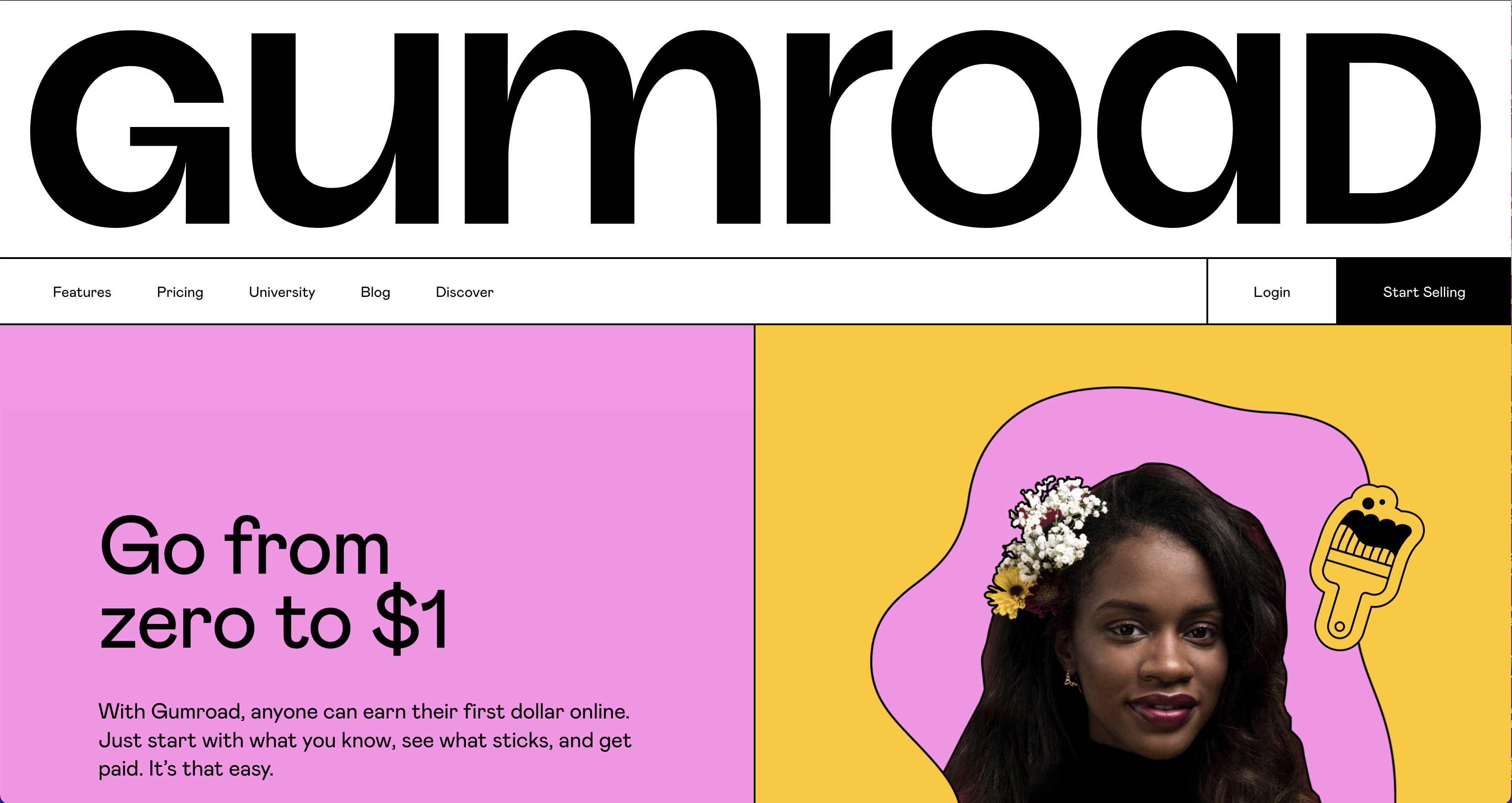
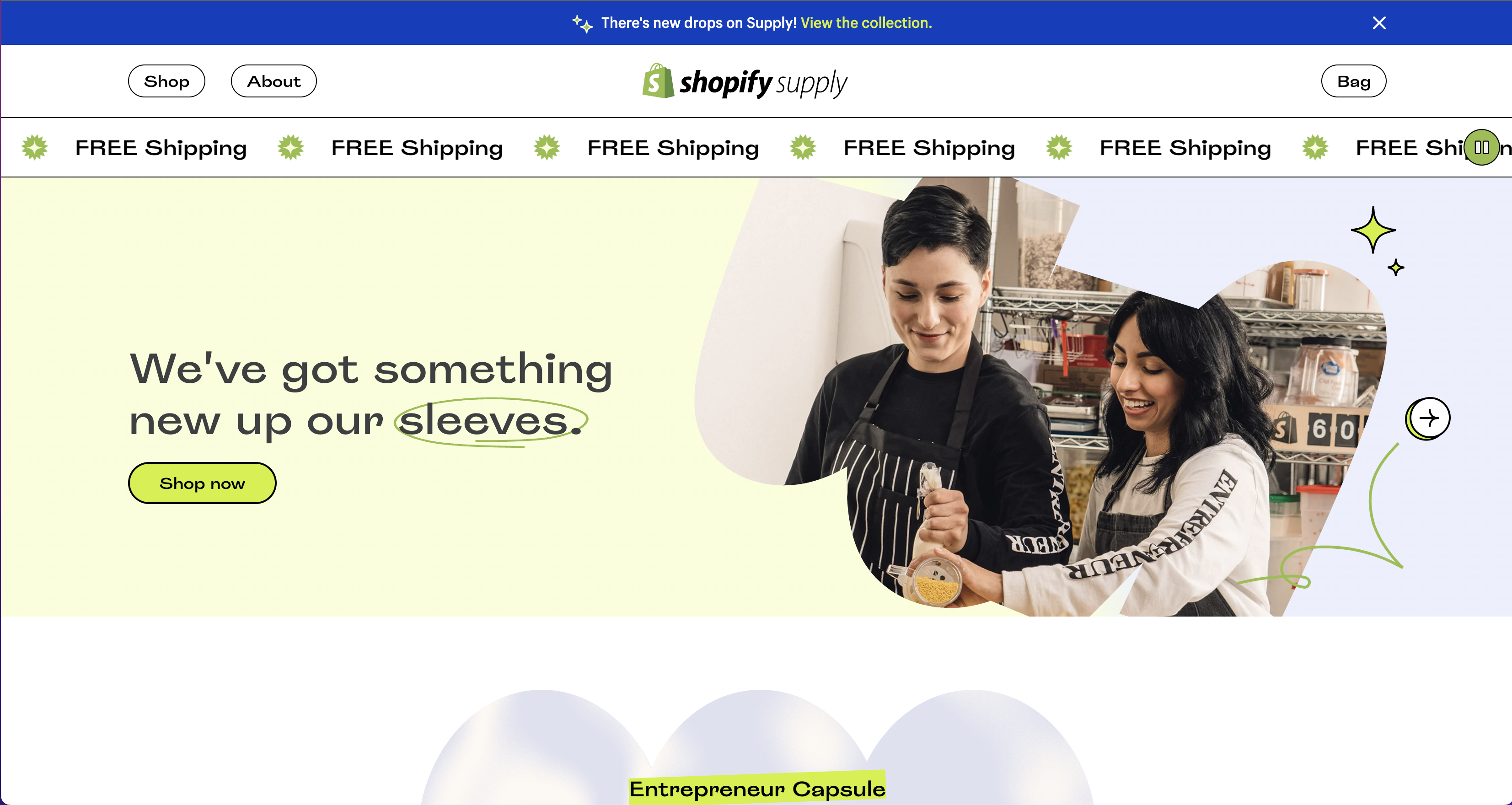
“2022 is the year Brutalism will help web designers make an impact. This style is characterized by harsh geometrics, lack of frills, and bold typography. However, it’s not to be confused with minimalism—Brutalism is much more utilitarian.”
As much as we were rooting for full-force Brutalism to take over the web scene, we understand it’s not always practical. It can be easy to use yet crude, plain, and stark. It can also be more experimental, eccentric, and brash.
“In the world of web design, such works could even be described as ugly, trashy, and even pompous, since in the most extreme cases, they completely neglect functionality and the users’ needs,” said Aleksandar Igrosanac of Qode Magazine.
Neo-Brutalist sites, however, are a lot more palatable for the average user. They’re less chaotic and easier to navigate while still being unconventional. The style rejects traditional color theory, uses bold lines, and relies on visual juxtaposition with high contrast.
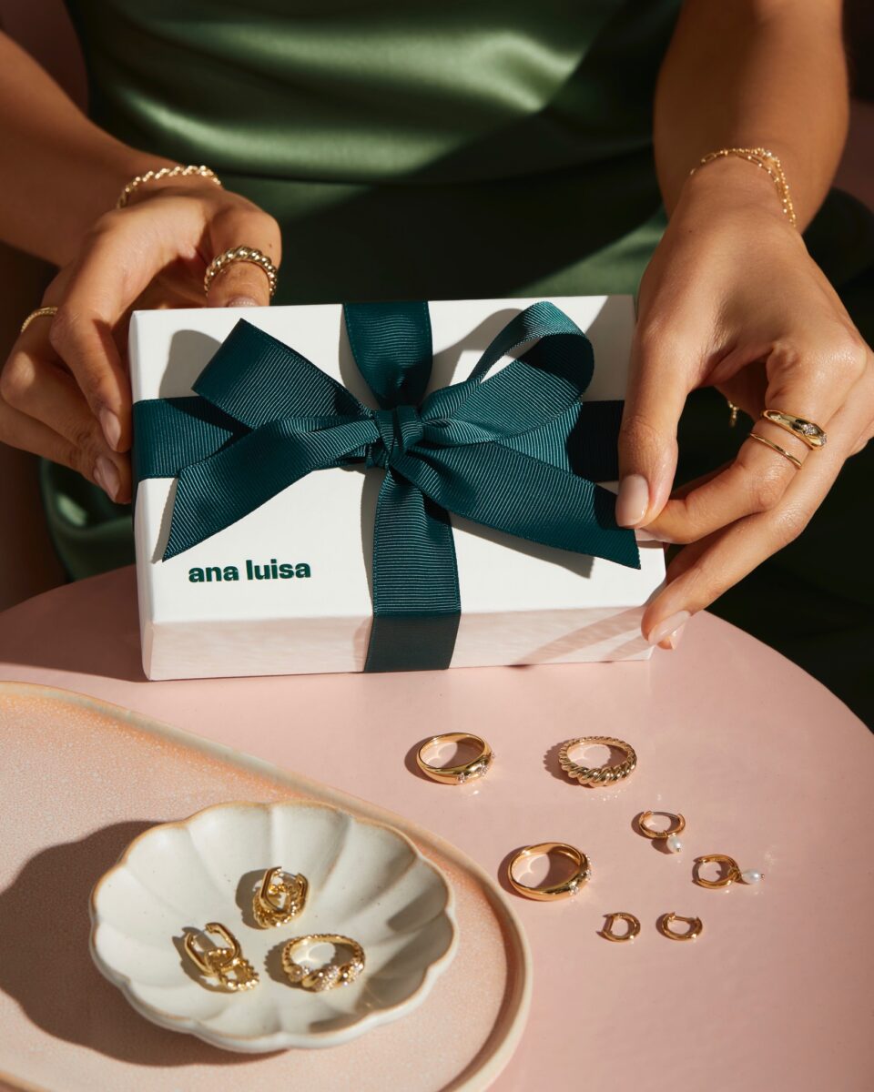
It’s more about function than form—bold images, heavy structure, and large fonts. The style doesn’t play by the rules and doesn’t need to be attractive. It gets straight to the point and is not about personal taste. Neo-Brutalism has gained popularity with e-commerce sites for clothing brands and jewelry designers. And while we love the look of this 2022 marketing trend, we know it’s likely not here for the long haul.
SEO
Continuous Scroll on Google Search
Traditionally, Google has used pages to display search results. After entering a query, users would scroll down to find what they’re looking for. If they wanted to see more results, they had to navigate using the arrows and numbers at the bottom of the page. However, few people made it past the first round of results.
Consequently, SEO has been a ruthless competition for the first page. But all of this has changed with the introduction of continuous scroll features. At the end of 2021, Google added continuous scrolling for mobile devices, showing four pages of search results before needing to click a “More” button.
Now, the search engine has added this feature for desktop users. According to Ivan Mehta, a reporter at Tech Crunch, “the new feature can also provide more visibility to sites that did not rank high enough to be on the first page.” As of December 2022, desktop users can load up to six pages of search results as they scroll, now showing around 60 individual results.

A Statement from Google
“So starting today, we’re bringing continuous scrolling to desktop so you can continue to see more helpful search results with fewer clicks. It’s now even easier to get inspired with more information at your fingertips,” said a Google spokesperson. “Now, when you scroll down you’ll continue to find relevant results so that you can discover new ideas. When you reach the bottom of a search results page, up to six pages of results will be automatically shown until you see a “More results” button if you wish to continue further.”
All of this comes at a time when people are longing for human interaction after the worst of the pandemic and resuming in-person events. And we can’t forget about the increasing inflation rate looming over consumers. Between the headset’s price, lousy timing, dystopian vibes, and vagueness of what the Metaverse has to offer—everyone has lost interest.
“Since Zuckerberg announced Facebook’s rebrand to Meta and its big bet on the Metaverse last year, Meta’s value has tanked. The company’s stock price dropped more than 70% in less than a year, with shares plummeting 23% after the company missed its earnings targets. After dropping out of the top 20 most valuable U.S. companies, Meta is now worth less than Home Depot.”


