Terminology for Non-Designers
Typography 101
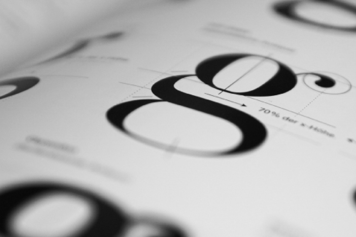
Let’s start with the most obvious term: typography. For non-designers, typography, typefaces, and fonts are probably interchangeable terms. However, there’s a noteworthy difference. Typography is the technique of arranging type. Yes, some people specialize in typography—they’re called typographers. Typically, they use letters as their graphic design medium.
A typeface is the design of the letters themselves. You know their names too—like Times New Roman, Myriad, Helvetica, and Baskerville. Technically speaking, the term font refers to the size of the lettering. For example, 10-point Helvetica and 12-point Helvetica are different fonts. But in everyday conversation, the terms typeface and font are mostly the same.
SERIF
- A serif is a decorative line that extends from the top and bottom of letters. They’re sometimes called feet, but it’s more like a hat with a matching pair of shoes.
Serif typefaces draw the eye across printed text and improve readability. The next time you read a book or a magazine, take notice of the font. Most likely, it’s a serif typeface.
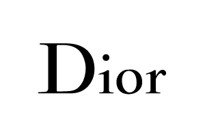
Because the serifs often look decorative, you’ll see a lot of high-end brands use them for a timeless, sophisticated look.
SANS SERIF
- Sans serif literally translates to “without line.” These fonts do not have any additional lines or strokes on the letters. In this way, a sans serif is less ornamental than a serif font. They look more straightforward and simpler. By the way, the words you’re reading right now are sans serif.
In print, they’re generally used for headlines and short excerpts because they don’t guide the eye as well as serifs. However, digital text adheres to its own set of rules. Generally, website content is broken into smaller pieces, making it easier to read.
That’s why you see websites use both serif and sans serif fonts in their body text. However, online newspapers or scholarly periodicals tend to go for serifs because there’s a lot more to read.

SLAB SERIF
- While we’re on the topic of serifs, we should also talk about slab serifs. These typefaces feature a bulky style of serif. These serifs are square and command attention because of their size. Historically, these typefaces were mainly utilized for typewriters. Today, they are mostly used for logos and package designs.
