Business Consulting + Digital Transformation
Ready Management Solutions
www.readyms.comReady is a consulting agency focused on solving their customers’ most complex tech challenges. They use technology to build forward-looking solutions and streamline operational systems into a cohesive framework that enhances business performance.
Project Goals
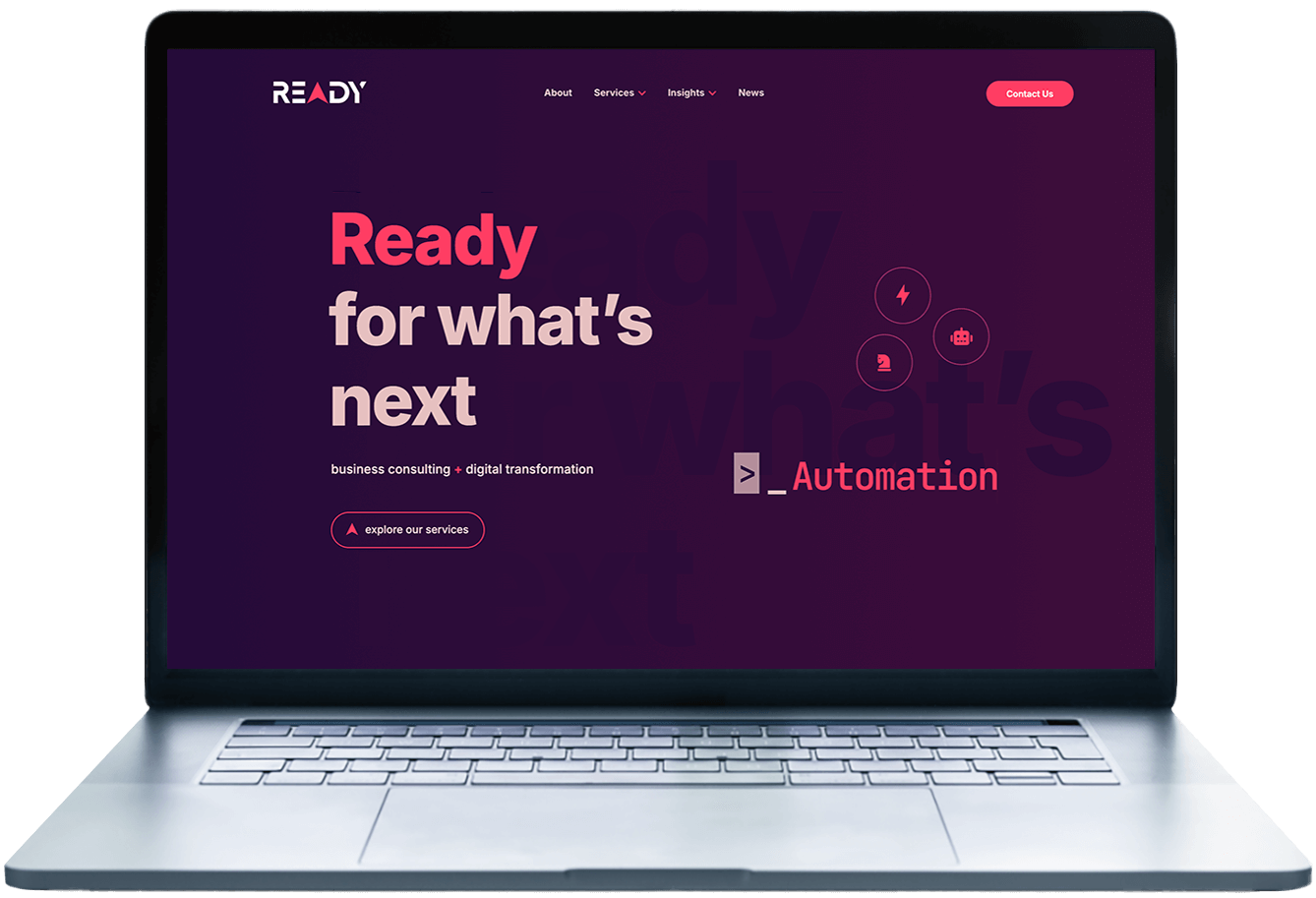
To create a website that better reflects the innovation and ingenuity of Ready’s team
The Highlights
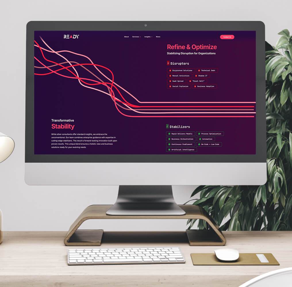
Graphics with subtle animations to make the minimalist design feel more interactive
Digital look
Web development
Ready's team envisioned a more modern website that genuinely reflected their high service level. They found their old website was dated and lacked cohesion, which didn't align with the image they wanted to project to their clients. They also believed that their website needed to articulate their services more effectively. A redesign was essential to match the brand's identity and elevate its online presence, showing its commitment to staying current and innovative.

Their original website featured a muted, cool-toned purple color scheme that was overshadowed by their signature hot pink. The contrast of these colors made the site look dated. The pink, while vibrant, dominated the overall design, making the site feel unbalanced and taking away from the user experience.
We wanted to make the website’s color palette more vibrant yet feel balanced. We centered our entire design around their logo's hot pink color and added deep, warm-toned purples to their color scheme. Incorporating warm purples into Ready's color palette created a more cohesive and balanced design. The combination of hot pink with these sophisticated purples elevated the overall aesthetic, giving the website a modern, polished look that better represents the brand and appeals to the audience's visual senses.
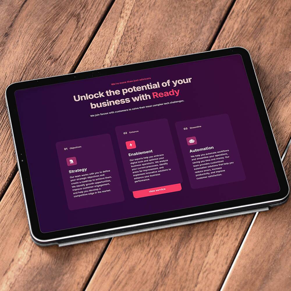
We simplified and clarified how Ready's services are presented across the site. This involved a thorough review of the existing content, restructuring the information flow, and using clear language to describe each service. We also opted for fewer stock photos and instead created custom graphics that better resonate with Ready's brand. This approach gave the website a more contemporary look and significantly enhanced the user experience, making it easier for visitors to understand who Ready is and what its team members stand for.
Features
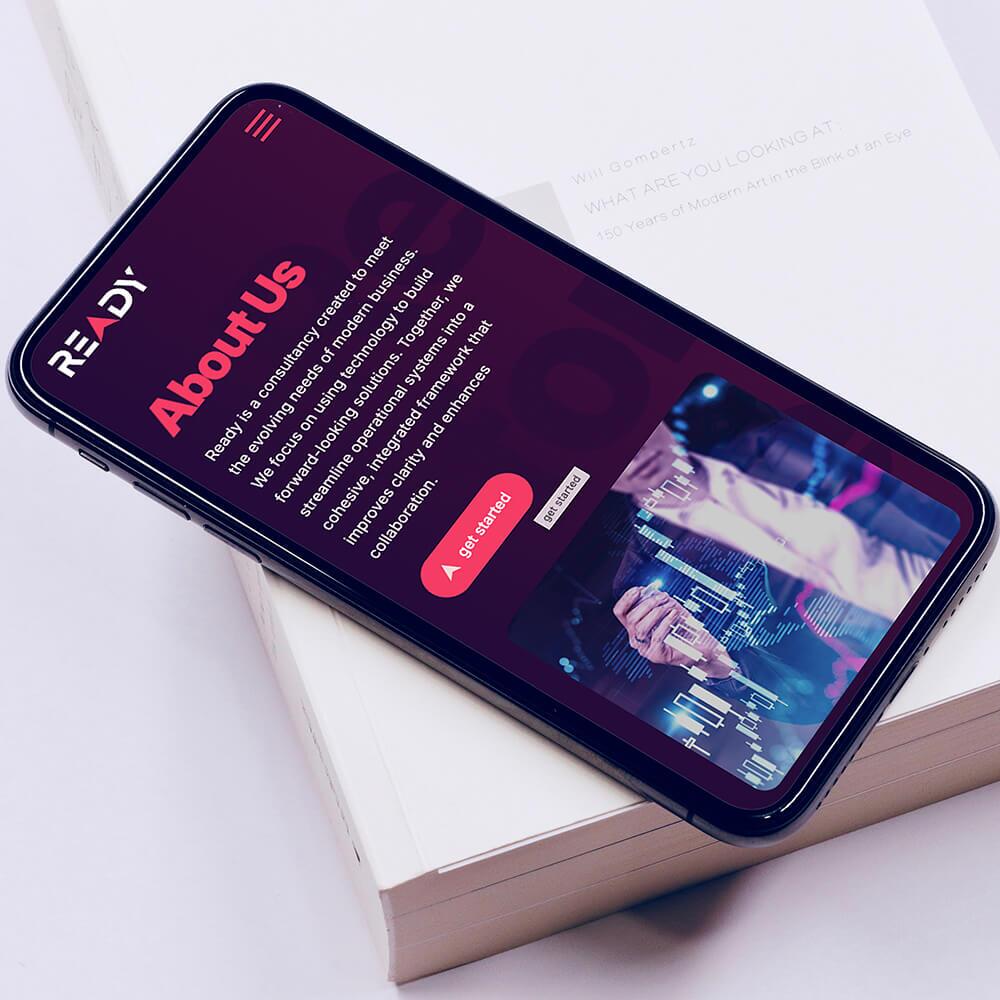
- Responsive design
- Case studies
- Blog
- Easy navigation
- Curated color scheme


