Branding Spotlight
The Origin of the Apple Logo
Designers and die-hard Apple enthusiasts act like the logo is a masterpiece, the pinnacle of minimalist design. But Apple’s logo wasn’t born iconic. It didn’t come into the world perfect and ready to be laser-etched onto aluminum. It started as a Victorian vignette—the design equivalent of a hardcover book’s dust jacket. It was lovely, but terrible at being a logo.
Then Apple did what strong brands do. They cut the ornament, found the idea, and protected it for decades. And let’s get this out of the way. The Apple logo doesn’t have a story of grand symbolism, like online speculation suggests—not the Garden of Eden nor a tribute to the computer science pioneer Alan Turing, who died by cyanide poisoning.
The truth is far less romantic. Apple’s logo choices were practical, product-led, and timing-aware. This isn’t a fairy tale about a perfect logo. It’s a track record of good decisions. Kill what doesn’t scale, keep what does, and let the product lead the narrative. What follows is the real origin story and the moments Apple tightened the brand without ever redrawing the bite.
Apple’s Origins: What Came Before the Bite
Apple was founded in April 1976 by a duo of college dropouts, Steve Jobs and Steve Wozniak. The pair began building their tech empire from the Jobs family home in Los Altos, California. In those first months, they shipped the Apple I as a bare circuit board without a monitor, keyboard, or casing. Priced at $666.66, the duo sold 200 units that year.
Everyone is at least vaguely familiar with this lore of Apple. Most of us have heard the same woe-is-me tale that business owners love to tell—it all started in a garage with a penny and a dream. Except it didn’t start in a garage. It began in a bedroom in an up-and-coming neighborhood now part of Silicon Valley.
And this origin story wouldn’t be complete without introducing the company’s third co-founder, Ronald Wayne. He met the forementioned duo while working as the chief draftsman at a newly established videogame company, Atari. There, Jobs worked as a technician while Wozniak, an engineering intern at Hewlett-Packard, assisted him in game design as a side project.
Wayne was nearly twice their age, had a family, and already witnessed the collapse of one business—a slot machine engineering firm based in Las Vegas. Despite Wayne’s past failures in the industry, Jobs proposed that the three start their own slot machine company. Wary about owning another business, Wayne turned the offer down. However, he recognized that Jobs was extremely ambitious despite his “very aggressive character” and cold demeanor. He was easier to convince when a new type of business offer arose.
This time, Jobs proposed that the trio start a personal computer company. Jobs and Wozniak would act as primary owners, each holding a 45 percent stake in the company. Wayne would enter as a minor owner with only a 10 percent stake, essentially acting as a tie breaker if the other two could not reach an agreement. The risk was small enough for Wayne to accept.
The First Prototype
After selling some of their personal belongings for quick cash to fund the project, the three began building the first Apple I prototype. Wayne drafted the trio’s ownership agreements, wrote the Apple I manual, and even designed their first logo before selling his stake just 12 days later. But why did he leave the company so soon?
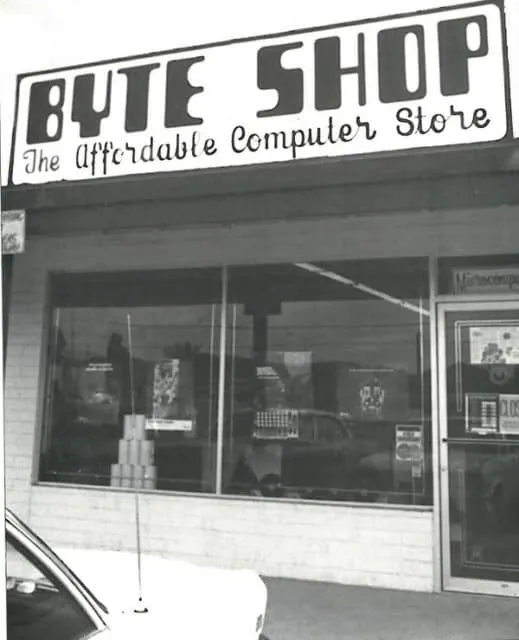
Jobs landed Apple’s first real order—50 machines from the Byte Shop. To fulfill it, they needed a $15,000 loan. Wayne was uneasy about taking on debt for a sketchy deal. He heard the Byte Shop had a bad reputation for paying its bills. If the deal went sideways, they wouldn’t just lose the business. With their three-way partnership, any unpaid bill could land on them personally.
“Jobs and Wozniak didn’t have two nickels to rub together. I had a house, and a bank account, and a car,” Wayne said in a 2016 interview with the BBC. He told the Steves he would still pitch in where he could, but he could no longer be an owner. A few months later, a letter showed up. “All you gotta do is sign away every possible interest you could have in the Apple Computer Company, and the cheque is yours,” he said. In return, Wayne was given $1,500.
The Newton Crest
Despite his departure, Wayne’s original logo remained in place for the company’s first year. The Victorian woodcut design depicts the moment Isaac Newton discovered gravity, sitting under an apple tree, book in hand. Although it was masterfully illustrated, the logo didn’t represent the company’s flair for innovation. Instead, it appeared antique, like the title page of a 19th-century science journal.
“In this logo, which they had me design, I captured Wozniak’s bizarreness,” Wayne said, referring to its featured quote by English Romantic poet William Wordsworth. “The logo with Newton in this Gothic frame with the ribbon and the inscription ‘Apple Computer Company’ was of course a 19th-century design, not a 20th-century design. I knew that already.”
Apple replaced the logo a year later, turning to Regis McKenna, an advertising and public relations agency, to modernize its image. “I think when Steve Jobs started to get serious about the Apple II and getting a prototype for the design of the shell, he realized that logo would not do. So he needed a new logo,” art director Rob Janoff said, who drew the now-famous bitten apple.
In an interview, he recalls Jobs had only one marching order for the logo. “Don’t make it cute.’” With little creative direction, he stopped by a grocery store and bought a bag of apples for inspiration, slicing them up and staring at the wedges for hours before drawing the logo freehand. Janoff and his team then presented two versions of it to Jobs. “One with and one without the bite. Just in case he thought the bite was too cute.”
The Rainbow Logo
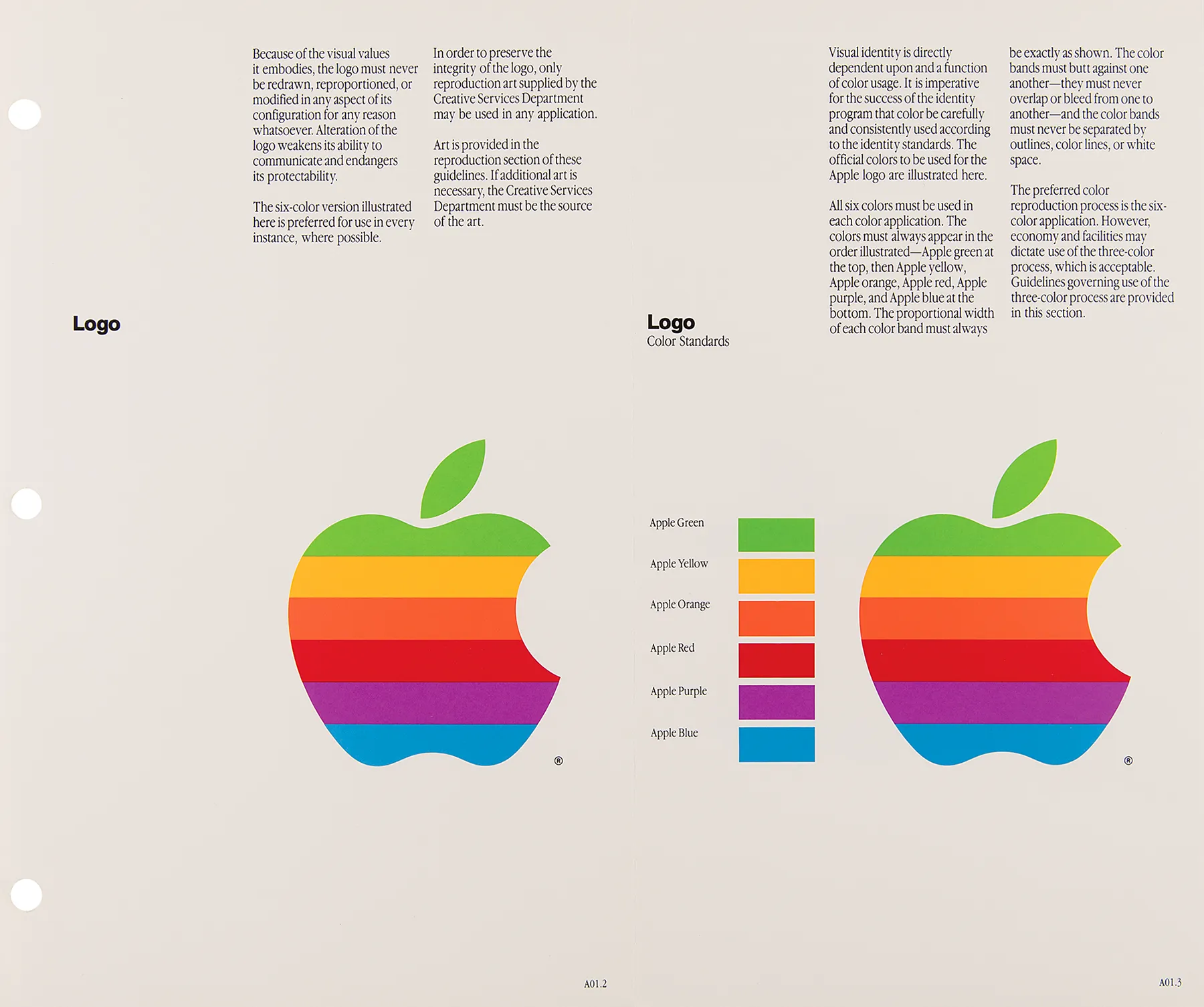
Despite major speculation among Apple enthusiasts, the bite wasn’t a biblical nod to the forbidden fruit or a byte pun. It was there for scale, so no one mistook the mark for a cherry. “Fortunately, he went with the one that gave it the most personality, with the bite. Frankly it was a no brainer,” Janoff said. “When I presented, I showed him several variations. Striped version, solid color version, metallic version. All those with the same shape.”
The rainbow stripes weren’t random either. Janoff admits the colorful look was initially inspired by hippie culture but served a greater purpose. “Both Steve and I came from that place, but the real solid reason for the stripes was that the Apple II was the first home or personal computer that could reproduce images on the monitor in color. So, it represents color bars on the screen. Also, it was an attempt to make the logo very accessible to everyone, especially to young people, so that Steve could get them into schools.”
The multi-colored logo was revolutionary for its time, as most companies stuck with one or two colors. “Steve liked the idea, because he liked things that were outside the box,” Janoff said. Despite immediate praise from Jobs, the logo received criticism from Regis McKenna’s leadership.
“I did get a lot of opposition from one of the higher account executives at agency. He was sort of working against me in the meeting where I presented the work to Steve. He made a comment that if this new company went ahead and produced stationery in all these colors, they will go bankrupt before they start the business. That was kind of the attitude that I was facing from the agency. But Steve liked it right off. He’s a pretty perceptive guy as we later learned and he liked the uniqueness of it as well.”</i >
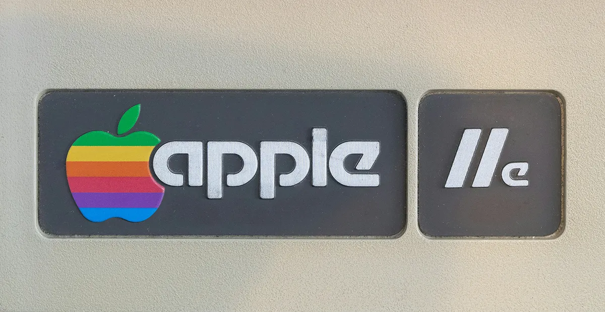
With the mark approved, Apple translated it into production-ready assets for everything—print ads, event signage, hardware badges, and even those tiny software labels on cassette tapes. The timing lined up with the Apple II’s debut at the West Coast Computer Faire in April 1977.
From that launch forward, the rainbow apple became a fixture on every Apple product for the next two decades. The logo received a couple of minor refinements in 1984 in preparation for the Macintosh release, including dropping the lowercase company name beside the Apple mark. “The design firm Landor & Associates made the changes. They brightened the colors, they made the shapes much more symmetrical, much more geometric,” Janoff said.
Off the Rails and Back Again
Steve Jobs left Apple in 1985 after a power struggle with CEO John Sculley and the board of product strategy. He resigned rather than sit on the bench at the company he co-founded. While he was gone, the company went rogue. It made a lot of products without a clear direction—like printers, cameras, the Newton, and a sprawling collection of nearly indistinguishable Mac models. The brand wandered aimlessly until Jobs returned in 1997 to a company bleeding cash and flirting with collapse.
Going Monochromatic
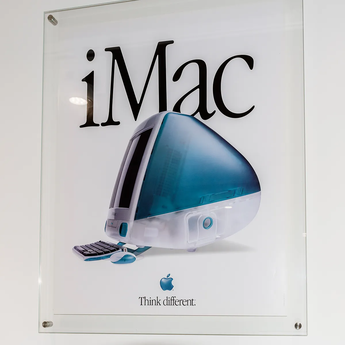
When he came back, he streamlined the overcrowded collection of products. Naturally, the logo followed suit. In 1998, the rainbow stripes gave way to a translucent, candy-blue logo embedded in the iMac G3’s original case design. The glassy look matched the cleaner hardware and minimalist packaging. It didn’t last long, however. By late 1998, the company switched to a flat, monochromatic mark to reintroduce Apple as a luxury brand.
Still, the striped logo didn’t vanish overnight. It lingered in software and user manuals until late 1999, when Apple formally told vendors to retire it and switch to the all-black version. The company released an Interim Corporate Identity Guidelines Sheet detailing the strict rules for using the new Apple logo. From here, the finish evolved with the times while the silhouette stayed the same.
“We’ve reduced some of the clutter in the original design, however, and updated the way we use color and light. In other words, we’ve taken the same standards of style and innovation that make our products and our design unmistakable and applied them to the company logo. Instead of rainbow stripes, solid colors. Instead of just one solid color, a palette of logo colors to suit a variety of uses. Solid colors emphasize the timeless shape of the Apple logo.”
Aqua
When Mac OS X arrived in 2001, Apple introduced the water-inspired logo to match the new user interface—gel buttons, soft highlights, and glassy software icons. The bitten apple kept its exact silhouette but took on a wet, dimensional finish called skeuomorphism.
Chrome
A Wired News article from September 2003 announced Apple’s debut of the chrome look with the release of Mac OS X 10.3, known as Panther.
“Panther is getting a brushed aluminum makeover, as well as a new logo. Instead of the current aqua color scheme, which makes use of bright colors and subtle pinstripes in much of the interface, of Panther has a lot of the metallic sheen previously restricted to individual applications, like iTunes or QuickTime.”
The update brought polished, metallic highlights across software and marketing, matching the brand’s shift toward white and aluminum hardware. “It is not clear whether Apple will adopt the new silver logo for product design, as well as marketing and packaging, or simply restrict it to the new software.”
This logo saw limited use until 2007. Apple retired the Aqua logo and officially adopted the chrome look with the release of the iPhone, matching its black glass and aluminum hardware.
Flat
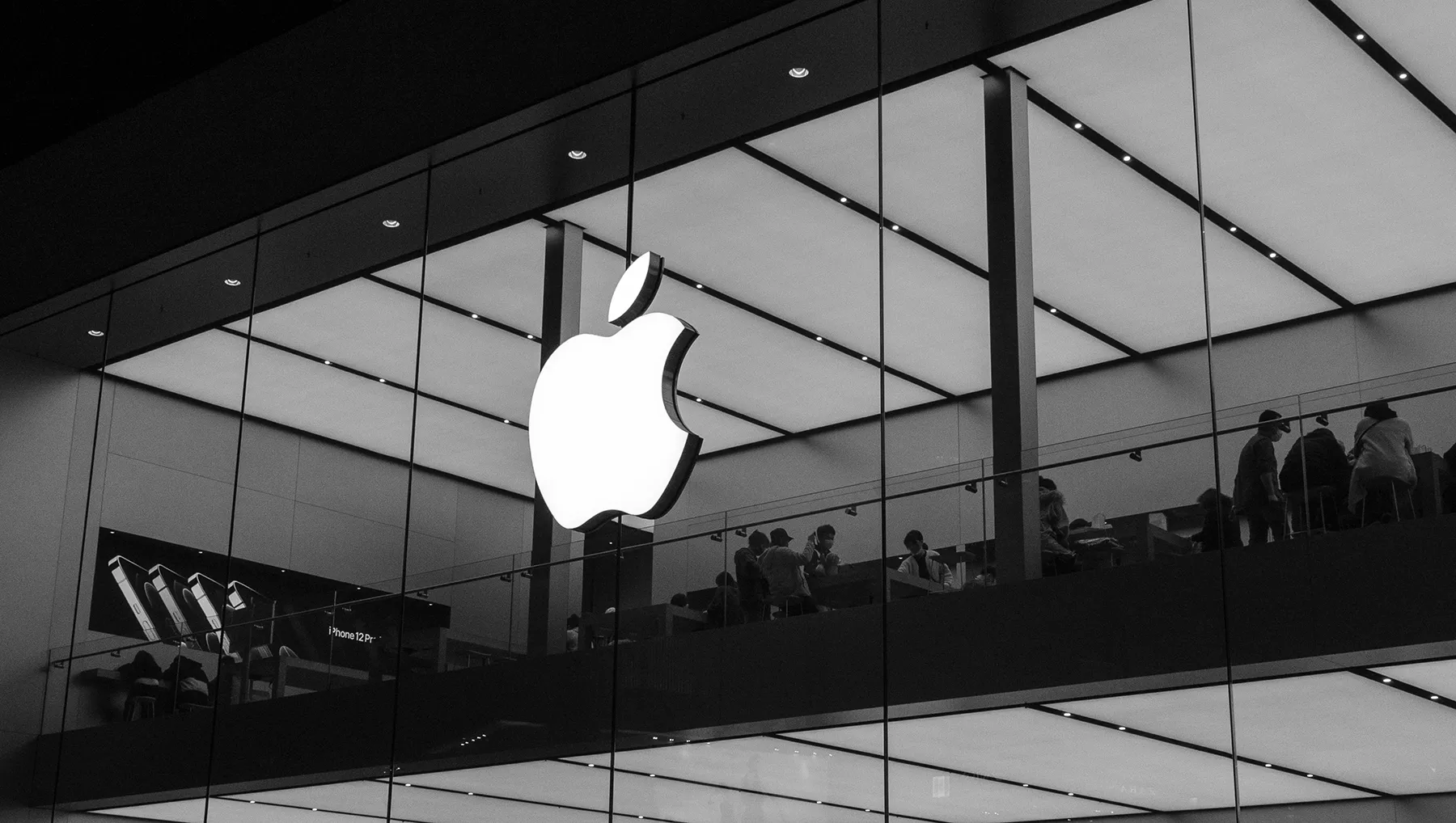
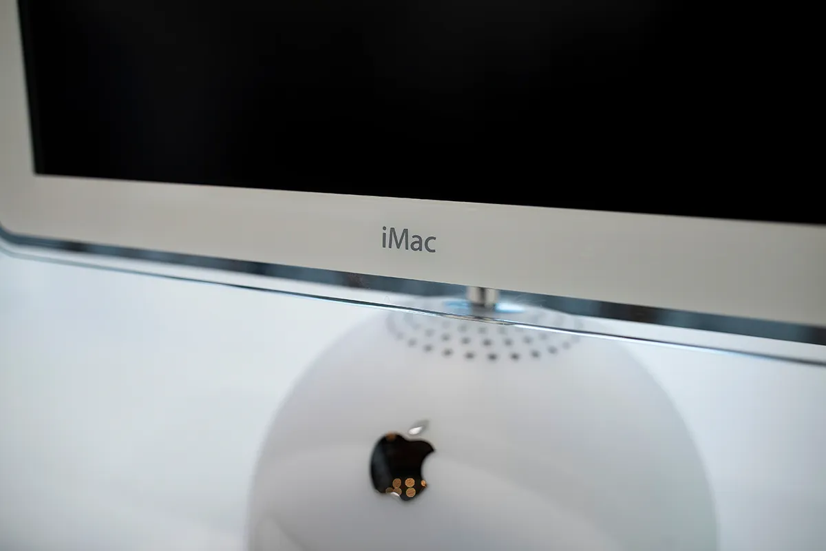
Apple stripped away skeuomorphism in 2013 with iOS 7, and soon after with OS X Mavericks. The metallic chrome logo was phased out in favor of the flat, monochrome mark introduced in 1998. And this version of the logo has stuck ever since. Today, the bitten-apple silhouette is a constant, flexing only in finish to fit the context—matte on a box, luminous on a store facade, minimal in an app icon.
Iconic logos don’t stay iconic by accident. Nearly five decades in, Apple has kept one promise—to protect the core and let everything else evolve on purpose. Rainbow when the color sold the story. Chrome when software and hardware shone. Flat when clarity beat cleverness. That’s not mystique. That’s strategy.
The story of Apple’s logo evolution is refreshingly unglamorous. When your mark carries the load, you don’t need stunts, just thoughtful updates that match what the product is doing right now. Keep the silhouette. Change the surface. Let the product speak.