Strategic use of color
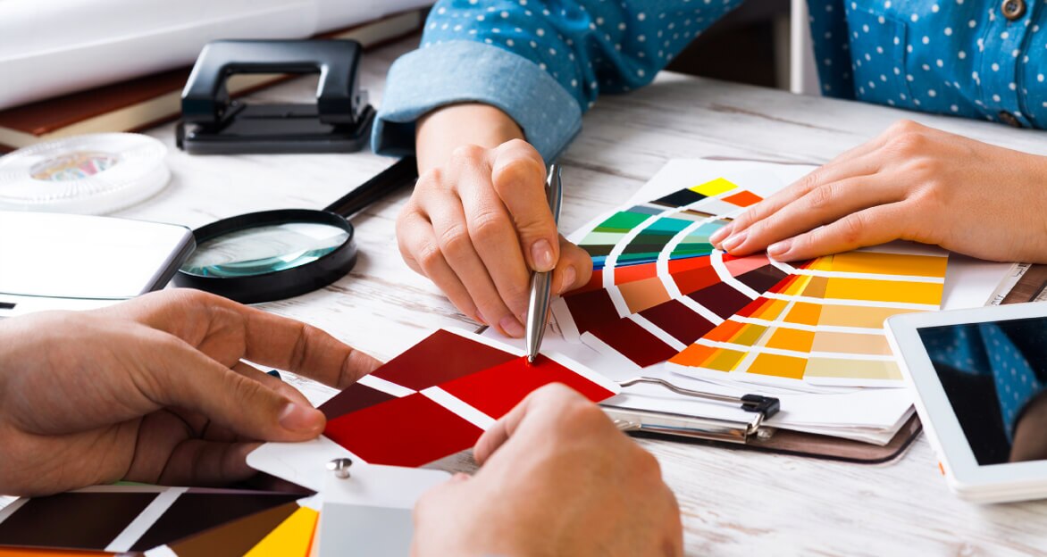
Corporate Color Schemes
Color is a non-verbal communication tool that can symbolize abstract concepts. Colors influence our thinking and decision-making. They can make us feel included or excluded, at ease or uncomfortable, and can even produce physical responses in the body. That’s why your brand’s use of color should be strategic. But we’re not just talking about your logo. We’re talking about the color schemes that make up your entire brand identity. And we’re here to help you narrow down your options.
Color associations
Color generates two types of responses in the human body—psychological and physiological
The perception of color is subjective. The brain subconsciously ties color to preconceived ideas based on cultural experiences. That means the same color can warrant varied emotional responses when shown to different populations.
In Western cultures, white is typically associated with purity and peace. In many Eastern cultures, it signifies misfortune, mourning, and death. But color psychology can also significantly differ between countries in the same part of the world.
For example, green can relate to infidelity and exorcism in China. However, it has a strong association with Islam, making it a religious color in countries with large Muslim populations. It’s also associated with Buddha, representing healing and balance in Tibet.
In Japan, green symbolizes life and prosperity, and married Korean women commonly wear it in ceremonial dress. But on the southern beaches of Indonesia, green clothing is forbidden because of a popular myth about death and a sea queen.
Generally, a person’s color preference will not trigger a significant physical response. However, the body involuntarily reacts, producing measurable effects. According to psychosocial author Kendra Cherry, “Certain colors have been associated with increased blood pressure, increased metabolism, and eyestrain.”
These physiological responses are not related to culture. Instead, they are universal and based on the stimulation of different regions of the brain. “Some evidence suggests that the light of different colors enters the eye and indirectly affects the hypothalamus, which in turn affects the pituitary gland. The pituitary gland controls the hormone levels and perhaps thus our moods.” Studies show these heightened physical responses are also linked to more efficient information processing and better memory.
The symbolism of color
| Color | Positive Meanings | Negative Meanings | Outcomes |
|---|---|---|---|
Red | Power, Action, Passion, Romance | Danger, Aggression, Violence, Heat | Creates a sense of urgency, heightens alertness, raises heart rate, and stimulates appetite |
Orange | Energy, Spontaneity, Youthfulness, Originality | Impatience, Demanding, Domination, Tackiness | Uplifts, energizes, stimulates, and grabs attention |
Yellow | Positivity, Joy, Happiness, Curiosity | Caution, Deception, Cowardice, Illness | Boosts enthusiasm and optimism, causes a release of serotonin, stimulates appetite, and can potentially cause eye strain |
Green | Growth, Prosperity, Nature, Luck | Envy, Materialism, Judgment, Toxicity | Relaxes and can lower blood pressure |
Teal | Peace, Concentration, Clarity, Communication | Stress, Narcissism, Secrecy, Introversion | Stabilizes emotion and reduces respiration |
Blue | Logic, Efficiency, Trust, Success | Passiveness, Depression, Boredom, Conservatism | Increases productivity, has a relaxing effect, lowers heart rate, and suppresses appetite |
Purple | Wealth, Royalty, Wisdom, Elegance | Sensitivity, Sadness, Mystery, Tension | Sparks creativity and fantasy, stimulates problem-solving, but can give the impression of falsehood and introversion |
Pink | Creativity, Innocence, Intuition, Calm | Emotional, Timidness, Passive, Immaturity | Evokes playfulness and femininity, soothes, and saturated versions can make a bold statement |
Brown | Seriousness, Reliability, Comfort, Earthiness | Dirt, Decay, Isolation, Old-fashioned | Brings a sense of nature and utility |
White | Cleanliness, Simplicity, Brightness, Purity | Empty, Sterility, Distant, Cold | Promotes self-reflection, adds no extra visual weight |
Gray | Practicality, Maturity, Intelligence, Stability | Indecisiveness, Unemotional, Gloominess, Old | Soothes but avoids attention |
Black | Authority, Sophistication, Luxury, Dignity | Grief, Pessimism, Detachment, Death | Adds edginess and visual weight |
Industry breakdown
Some industries gravitate toward colors because of their psychological associations. For example, we are more likely to see white used in the healthcare industry than brown. White indicates sterility, while brown is often associated with earth and nature.
Niche brands, however, often have more room to play with unexpected color combinations. While brown is an uncommon color for major healthcare networks, it may be appropriate for health brands that use naturally derived ingredients in their products.
Agriculture and Garden
60% of industry-leading logos include green
- Most popular color:
Green - Top pairings:
White, blue, and black - Raising in popularity:
Red, yellow, and brown - Uncommon colors:
Purple and gray - Least popular:
Pink
Healthcare
85% of industry-leading logos include blue
- Most popular color:
Blue - Top pairings:
White and gray - Raising in popularity:
Green - Uncommon colors:
Yellow, pink, and brown - Least popular color:
Purple
Law
20% of all industry-leading logos include white
- Most popular color:
White - Top pairings:
Blue, black, and gray - Raising in popularity:
Red - Uncommon colors:
Green, orange, purple, pink, and brown - Least popular color:
Yellow
Real Estate
68% of industry-leading logos include blue
- Most popular color:
Blue - Top pairings:
White, black, and gray - Raising in popularity:
Red, yellow, and green - Uncommon colors:
Brown and orange - Least popular colors:
Purple and pink
Finance and Accounting
66% of industry-leading logos include blue
- Most popular color:
Blue - Top pairings:
Black and white - Raising in popularity:
Green and gray - Uncommon colors:
Yellow, purple, and brown - Least popular color:
Pink
Retail
59% of industry-leading logos include red
- Most popular color:
Red - Top pairings:
White, blue, and black - Raising in popularity:
Yellow, green, and orange - Uncommon colors:
Gray, pink, and brown - Least popular color:
Purple
Marketing and PR
27% of industry-leading logos include blue or gray
- Most popular colors:
Blue and gray - Top pairings:
Black and white - Raising in popularity:
Red - Uncommon colors:
Green, orange, and pink - Least popular colors:
Yellow, purple, and brown
Technology
61% of industry-leading logos include blue
- Most popular color:
Blue - Top pairings:
White, black, and red - Raising in popularity:
Green and yellow - Uncommon colors:
Gray, purple, and brown - Least popular color:
Pink
Your brand’s color scheme will create emotional and physical responses in customers, intentionally or subconsciously. However, our perceptions of color change with age because of altered physiological responses.
“An increase in accuracy of color discrimination occurs between the ages of two and six. Generally, it is not until age fifteen that youth can discriminate colors as accurately as adults. Peak discrimination occurs between about ages 20 to 30 years and then may become less accurate and glare sensitivity may increase, especially around age 65.”
College of Agriculture at the University of Kentucky
This development in color discrimination is why children statistically prefer bright, primary colors over pastels. As children grow, interest in cooler and darker colors increases as the need for high-intensity color decreases. As a result, the majority of adults prefer blue. “Some researchers suggest the order of preference by adults as blue, red, green, violet, orange and yellow.” Our preferences change again in older age. “Studies of people from ages 65 to 90 indicate they prefer bright colors to pale pastels. This may relate to the physical changes in the eye.”
Gender and color preferences
Statistically, gender identity influences color preferences. Per a Kissmetrics study, both males and females like blue. Out of 232 participants, 57 percent of males said blue was their favorite color, while 35 percent of female participants also preferred blue.
“The most notable gender difference can be seen in the color purple. The study reported that 23 percent of female participants chose purple as their favorite. No males chose purple as their favorite.” Otherwise, there were no drastic disparities between the two datasets.
According to their findings, “both men and women had the same general preference when it came to light and dark colors. However, the experiment showed that women gravitate toward soft colors, while men like bright ones.”
Color Palettes
Creating a color scheme using basic color theory
Primary
Colors that make all other colors—red, yellow, and blue
Secondary
Colors created by combining primary colors – orange, green, and purple
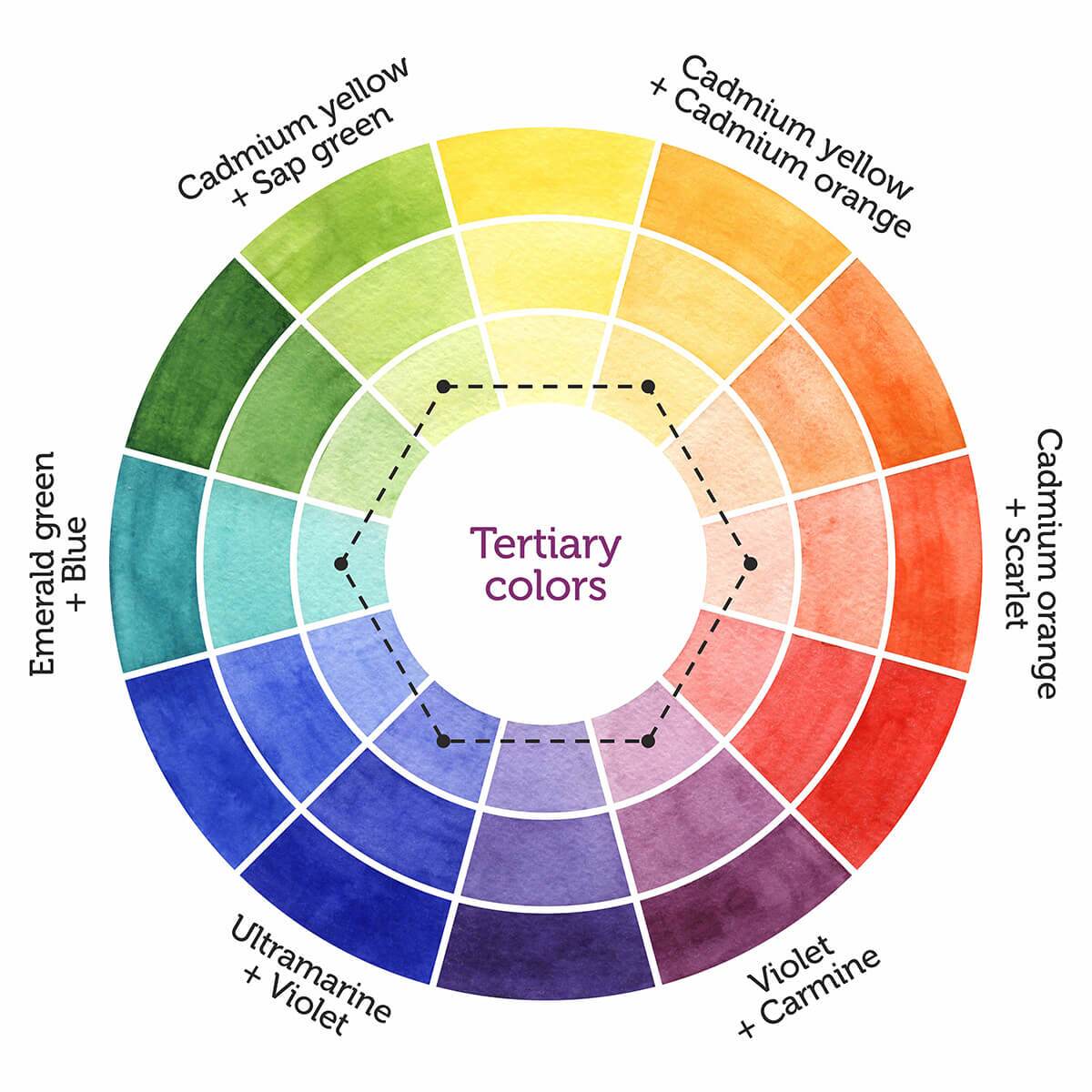
Tertiary
Colors are created by combining a primary color with a secondary color. They often have compound names like red-orange or are named after minerals or chemical compounds, like vermillion.
Monochromatic
Combining various shades and tints of a single color
Complementary
Combining warm and cool colors that are directly opposite on the color wheel
Analogous
Combining colors that are directly next to each other on the color wheel
Selecting your corporate color scheme is more complex than picking your favorite colors. It’s about communicating with your ideal customer in a culturally relevant way that suits their preferences. But there are millions of options for your color scheme between shades and tints. Let’s find colors that will correctly communicate your brand’s message.
Branding